
Table of Contents
Building Eye-Catching HTML Emails
HTML emails have developed into a key part of modern marketing and communications campaigns. HTML emails provide individuals and brands with control to connect people through engaging and interactive content. When well implemented, HTML emails enhance levels of engagement and convert passively receiving people into active customers or loyal subscribers.
Unlike plain emails, HTML emails permit using color, typography, logos, and layout to convey a cohesive brand experience. HTML emails also make it easy to insert clickable buttons, promo banners, and inline images that reinforce your marketing statements. By including these interactive features, you can make ordinary email newsletters richer, and more enjoyable experiences for your audience.
Understanding HTML Emails
HTML emails are formatted very much like web pages. You can use headings, paragraph tags, tables, and divisions to format your content nicely. But there are rules and limitations of email programs that are very different from most web browsers, so there are aspects of CSS or JavaScript that will never function consistently within the inbox.
In general, HTML emails are sent out as well-structured HTML documents. When it is opened, the receiving email client will translate the code to view images, interactive items, and text accordingly. Some email programs or email clients will automatically suppress part of the code by default, so planning carefully and thoroughly testing is important to make sure everything displays on most devices and platforms consistently.
Basic Setup and Structure
A typical HTML email is preceded by a doctype declaration followed by an opening tag of HTML, although others employ a simpler structure due to compatibility issues. Inline CSS is what most developers employ, considering how most email programs remove or discard embedded or external stylesheets. That leaves each part styled separately using its respective style attribute.
Ensuring that your HTML email is mobile-friendly is troublesome due to the varied support of modern CSS by varied email clients. A generally recommended practice is employing a table-based layout to make your HTML email universally compatible. While tables are out of date in overall web layout, tables are useful within HTML emails to make your HTML email universally compatible along with preserving layout on mobile devices.
Crafting a Basic HTML Email Example
Below is a streamlined example of an HTML email showcasing a newsletter-style format. It highlights a header area, multiple content sections, and a footer. All styling is included inline for reliable rendering across major email clients.
<div class=”container” style=”max-width: 600px; margin: 0 auto; background-color: #f9f9f9;”>
<div style=”background-color: #333; color: #fff; padding: 20px; text-align: center;”>
<h1 style=”margin: 0; font-size: 28px; font-family: Arial, sans-serif;”>
Welcome to Our Monthly Update 🚀
</h1>
</div>
<div style=”padding: 20px; font-family: Arial, sans-serif; color: #333;”>
<h2 style=”color: #555; margin-top: 0; font-size: 22px;”>
Latest News 📰
</h2>
<p style=”font-size: 16px; line-height: 1.6;”>
Stay in the loop with our recent product releases and updates. Explore exciting new features designed to enhance your user experience and streamline your workflow. Each innovation is crafted to meet your evolving needs in a rapidly changing digital landscape.
</p>
</div>
<div style=”background-color: #fff; padding: 20px; font-family: Arial, sans-serif;”>
<h2 style=”color: #555; margin-top: 0; font-size: 20px;”>
Featured Article ⭐
</h2>
<p style=”font-size: 16px; line-height: 1.6;”>
Discover expert insights in our latest blog post, including best practices for designing responsive and visually appealing emails.
<a href=”https://www.mailchimp.com/” style=”color: #007bff;”>Learn more here</a> about effective campaigns powered by modern email platforms. Elevate your marketing strategy by adopting techniques that drive real results.
</p>
</div>
<div style=”padding: 20px; text-align: center;”>
<a href=”https://www.mailchimp.com/”
style=”background-color: #007bff; color: #fff; text-decoration: none; padding: 12px 24px; border-radius: 5px; font-family: Arial, sans-serif;”>
Read More Tips 👉
</a>
</div>
<div style=”background-color: #333; color: #fff; padding: 15px; text-align: center; font-family: Arial, sans-serif;”>
<p style=”margin: 0; font-size: 14px;”>
© 2025 Your Company. All rights reserved.
<br>
<a href=”#” style=”color: #fff;”>Unsubscribe</a>
</p>
</div>
</div>
The output:
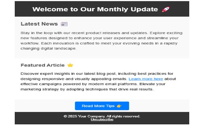
Simple HTML Newsletter Template
This snippet creates a streamlined newsletter format. A dark header establishes the subject or brand, immediately focusing the viewer’s attention. A variety of pieces of information are displayed within multiple sections, providing clear and easy-to-follow order. Inline styles are added where possible to ensure maximum compatibility, whereas calls to actions are marked up using basic button-like links.
Visually, it is much like a quick, friendly newsletter asking individuals to learn more or contribute through content of interest. Minimalistic styling ensures cleanliness of form, while color contrast (dark header vs. white content areas) ensures readability by most of its audience.
Adding Multimedia Elements
HTML emails exist on images, banners, or logos but ensure that you keep an eye on the size and loading times of files. Big images can make emails take too much time to load or will be blocked by certain email programs. Use alt tags on images to ensure images can be accessed by visually challenged individuals or where images are not loading.
You can embed a company logo at the top, followed by banners promoting throughout the email. While inserting videos within is most often problematic within specific email programs, external links or animated GIFs can act as a helpful replacement. Uniform styling along with thoughtful placement of these items maintains things professional without slowing up the user.
<div style=”text-align: center; margin-bottom: 20px;”>
<a href=”https://getbootstrap.com/”>
<img
src=”https://getbootstrap.com/docs/5.1/assets/brand/bootstrap-logo.svg”
alt=”Bootstrap Logo”
style=”max-width: 150px;”
/>
</a>
</div>
<p style=”font-size: 16px; text-align: center;”>
Check out our newest feature launch in this quick demo:
</p>
<div style=”text-align: center;”>
<a href=”https://example.com/video-overview” style=”color: #007bff;”>
Watch the video
</a>
</div>
The output:
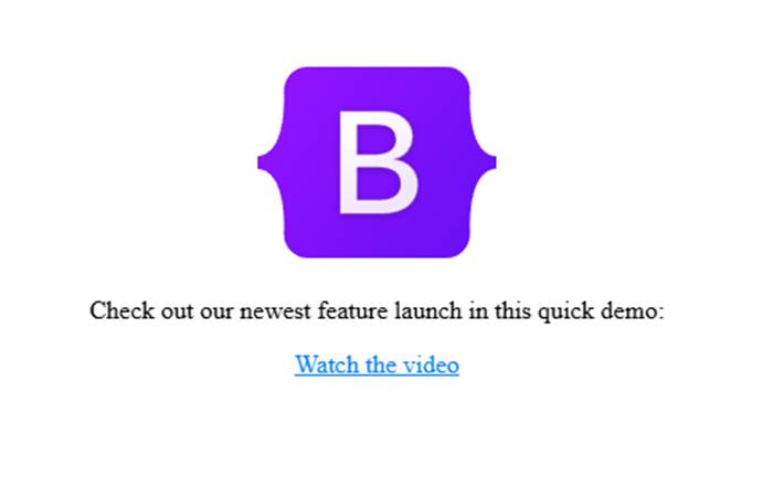
HTML Email with a Logo and Video Link
This ensures your brand is up top, leveraging your credibility and familiarity. The recipient is greeted immediately by your logo and can watch a video introduction for added insight. Sending out a link versus attaching a video prevents potential playback issues on diverse inbox providers.
Styling Buttons and Links
One major advantage of HTML emails is that there is scope to make compelling buttons that will make people click on them. You can make your <a> tags look like buttons using inline CSS. You can use bright colors, round corners, and padding to make it visually appealing.
<a href=”https://example.com/shop”
style=”background-color: #e74c3c; color: #fff;
padding: 10px 20px; text-decoration: none;
border-radius: 4px; font-family: Arial, sans-serif;”>
Shop Now
</a>
The output:
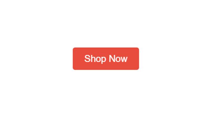
A Bold Call-To-Action Button
The button stands out on its bright red background, asking people to click or buy. Ample padding and clear typography will make a big difference in clicks. Such clear calls to action will guide prospective customers to the next stage without confusion.
Ensuring Responsiveness
Responsive design in email marketing is what ensures your emails will look good on every screen size, from large desktop displays to mobile devices. Not every email client is completely on top of modern CSS techniques, though, so developers have to resort to tables and basic media queries.
When you test, observe closely for scaling of images, buttons, and fonts, making sure that no wide items break the mobile layout. Narrower widths and larger text on narrower devices make big differences to how readable your content is to your audience.
In practice, perfect responsiveness is only achievable through iterative testing. Litmus or Email on Acid are great resources that have good test environments where your emails can be viewed on numerous devices. You will learn your design process to accommodate as many email clients as possible through iterative processes over time.
Delivering Your HTML Emails
After designing your HTML email, you need to send it out to your audience. Some marketers use specialized software like Mailchimp or other industry-leading providers to automate sending, list management, and metrics on campaigns. For additional innovative solutions, you might consider exploring Selzy to enhance your delivery process. Some install their own SMTP servers, but that requires tech know-how and ongoing administration.
Integrating your HTML email code into most of these platforms is done by cutting or uploading your file into a custom code editor. After inserting subject lines, preview texts, and recipient lists, you can opt to send your email immediately or schedule it to be sent sometime later on. Tracking your open rates and click-through rates can determine success levels and improve your next campaigns’ performance levels.
Avoiding Common Pitfalls
Creating compelling HTML emails is never without its disadvantages, though. Some email software automatically disables images or external scripts to defend against spam or malicious emails. That means your carefully placed background or header will only appear if the recipient elects to view images. Making your email readable without images is critical to making your content readable and meaningful even if images are disabled.
Another stumbling block is spam filtering. Your HTML email can be marked if there are suspect keywords, too many images, or too much use of punctuation. Being compliant with best practice email marketing and laws within your region means your sender reputation will stay good. It means providing an unsubscribe link, labeling content truthfully, and avoiding misleading subject matter or content.
Practical Example using Multimedia, Buttons, and Inline Styles
Below is a more complex example that incorporates many of the features that have been covered here: logo, promo areas, inline images, calls to action, tables to maintain layout stability across email clients
<table width=”100%” cellspacing=”0″ cellpadding=”0″ style=”background-color: #fafafa;”>
<tr>
<td align=”center”>
<table width=”600″ cellspacing=”0″ cellpadding=”0″ style=”margin: 20px auto;”>
<!– Header –>
<tr>
<td style=”background-color: #2c3e50; padding: 20px; text-align: center;”>
<img
src=”https://getbootstrap.com/docs/5.3/assets/brand/bootstrap-logo-shadow.png”
alt=”Bootstrap Logo”
style=”display: block; margin: 0 auto; max-width: 120px;”
/>
</td>
</tr>
<!– Hero Section –>
<tr>
<td style=”background-color: #ecf0f1; padding: 20px;”>
<h1 style=”font-family: Arial, sans-serif; margin: 0; color: #34495e; font-size: 24px;”>
Discover Our New Arrivals 🌟
</h1>
<p style=”font-family: Arial, sans-serif; color: #666; font-size: 16px; line-height: 1.5;”>
We’ve expanded our catalog with fresh and exciting products, carefully selected to meet your every need.
Enjoy exclusive deals and limited-time offers to make your shopping experience even more rewarding.
Hurry up before stocks run out! 🔥
</p>
<a
href=”https://example.com/new-arrivals”
style=”
display: inline-block;
background-color: #2980b9;
color: #ffffff;
text-decoration: none;
padding: 10px 20px;
border-radius: 5px;
margin-top: 10px;
font-family: Arial, sans-serif;
“
>
Shop Now
</a>
</td>
</tr>
<!– Product Section –>
<tr>
<td style=”background-color: #fff; padding: 20px;”>
<img
src=”https://img.freepik.com/free-photo/wondered-excited-amused-cute-redhead-woman-yellow-sweater-pointing-fingers-down-look-bottom_1258-126183.jpg?t=st=1739816172~exp=1739819772~hmac=5b7ae4a226227962f7f0eb8b98911d1d85337121afa20cae898e9abe491919b4&w=1380″
alt=”Promotional Banner”
style=”width: 100%; height: auto;”
/>
<p style=”font-family: Arial, sans-serif; color: #333; font-size: 16px; line-height: 1.5; margin-top: 15px;”>
Looking to upgrade your tech gear? Dive into our newest selection of gadgets with cutting-edge features
and sleek designs. Whether you need a powerful laptop or a smart wearable, we have you covered with
top-notch recommendations and unbeatable prices.
</p>
</td>
</tr>
<!– Footer –>
<tr>
<td style=”background-color: #34495e; padding: 20px; text-align: center;”>
<p style=”font-family: Arial, sans-serif; color: #ecf0f1; font-size: 14px;”>
© 2025 TechStore, Inc. All rights reserved.
<br />
<a
href=”#”
style=”color: #ecf0f1; text-decoration: underline;”
>
Unsubscribe
</a>
</p>
</td>
</tr>
</table>
</td>
</tr>
</table>
The output:
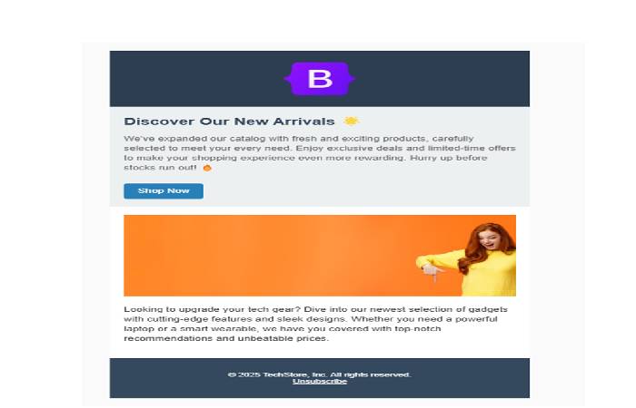
HTML Email using Table-Based Structure for Stability
This design features a well-designed newsletter that features a prominent hero, a product feature, and a brief footer. By putting content into tables, we make sure that content is displayed consistently by email clients like Outlook, Gmail, and Apple Mail. Inline styling is also utilized to make sure that there is very little room for email client takeover.
Final Thoughts on Best Practices
HTML emails are also a great vehicle for building relationships with customers or readers. Don’t forget mobile devices by using a responsive layout that scales well. Use clear, readable code that has good alt tags on images and balanced color schemes to ensure that every recipient can view your email well. Don’t forget that testing is important too – what might appear perfect in one client can break elsewhere.
Make sure to track key performance metrics including open rates, click-through rates, and conversions. All of that assists you in refining content, subject lines, and designs along the process. The objective is ultimately to give value within each email, keeping your healthy set of subscribers actually waiting on your updates.
Bio of author
Mrs Lardeedah is a blogger and email marketing enthusiast passionate about understanding audience behavior. She helps small brands discover their unique voice through newsletters and social posts.